WPM logo design (rebrand)
March 2021: William Property Management logo and signage design (rebrand).

The brief was to redesign William Property Management’s logo. The client specified they want to keep / use the existing logo colour (green). They also outlined the brand gives a sense of family, community, security, guardianship and that the company is ecologically sound.
I created three logo design routes initially, and during the design process, additional colour(s) were introduced and agreed upon.
Below illustrates how the logo translates to black and white.

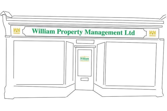
Further to logo rebrand, I supplied a visual for the property front (signage design). This was a very simplified visual indicating size and position of logo.

The process started with discussing what the client’s brand values are, with a large portion of the discussion about the thought behind the logo (pre redesign). The logo had a castle line drawing incorporated in the design.
The next stage of the process is to apply the logo to the signage, stationery and signage boards.
Neil Brown (website designer), who I often work alongside, designed and created the new website for William Property Management – click on link below to view website.
Back to Home page...